What is Color Theory Exactly?
Color theory is the art and science of using color. It describes the visual effects of how colors mix, harmonize and contrast with each other. Color theory is also associated with color psychology; the study of hues as a determinant of human behavior.
But why is color theory important for design? Read on to learn more.

Color theory is arguably the most important element of design. When you choose colors, the decisions should be carefully considered in order to communicate the right message. This is especially true in types of graphic design such as branding, and user interface design. Let’s dive into understanding color theory.
Understanding Color
We should probably start with knowing, what is color exactly? In short, color is the characteristic of human visual perception defined by color categories (red, green, blue etc). The human eye takes in visual information, such as reflected light from objects, and passes it to the brain. As a result, we see color.
Color Modes
RGB

RGB is an additive color model in which red, green and blue light are added together in various ways to reproduce a broad array of colors. The name RGB comes from the initials of the three additive primary colors, red, green, and blue.
CMYK

CMYK is a subtractive color model, based on the CMY color model, used in color printing, and is also used to describe the printing process itself. To Clarify, CMYK refers to the four ink plates used in some color printing. The name comes from its initials cyan, magenta, yellow, and key (black).
Pantone

Pantone is a standardized color matching system, utilizing the Pantone numbering system for identifying colors. With the standardization of colors, different manufacturers in different locations can all reference a Pantone numbered color, making sure colors match without direct contact with one another.
The most commonly referenced colors are in the Pantone solids palette. In conclusion, Pantone colors are best for ensuring color is printed in a consistent manner.
HSV

HSV (hue, saturation, value) and HSL (hue, saturation, lightness) are alternative representations of the RGB color model. In these models, colors of each hue are arranged in a bar or radial slice of neutral colors which ranges from black at the bottom to white at the top.
Color Wheel Definition

The color wheel is an abstract illustrative organization of color hues around a circle, that shows the relationships between primary colors, secondary colors, tertiary colors etc. Sir Isaac Newton designed the first color wheel in 1666. It has stood the test of time, as designers are still using it today.
Primary Colors

Primary colors in the RGB (Red, Green, Blue) color wheel are the colors that, when added together, create pure white light.
Secondary Colors

Secondary colors are green, orange and purple, which are created by mixing two primary colors.
Tertiary Colors
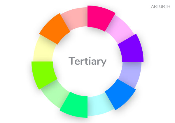
Tertiary colors are a combination of primary and secondary colors. There are six tertiary colors; red-orange, yellow-orange, yellow-green, blue-green, blue-violet, and red-violet.
Color Schemes
Analogous

Analogous colors are groups of three colors that are next to each other on the color wheel. They share a common color, with one being the dominant color, which tends to be a primary or secondary color, and a tertiary. Red-violet, violet, and blue-violet are examples.
Complementary

Complementary colors are two colors that are on opposite sides of the color wheel. This kind of color combination offers high contrast.
Split Complementary

Split complementary color schemes are a variation of the complementary color scheme. It uses the base color and two colors adjacent to its complement. This color scheme has high contrast as the complementary color scheme but more relaxed.
Compound

Compound colors are two sets of complementary colors that the base colors are next to each other on the wheel.
Tetradic

Tetradic color schemes use a combination of four colors that consist of two sets of complementary colors. For example, red with light blue plus yellow with dark blue.
Triad

A triadic color scheme consists of three colors evenly spaced on the color wheel. The two most basic triadic palettes are the primary colors red, blue, and yellow and the secondary hues orange, purple, and green.
Monochromatic

Monochromatic colors are all the colors (tones, tints and shades ) of a single hue.
Shade, Tint, Tones

Shades
A shade is created by adding black to a base hue. The result is darkening the color.
Tint
A tint is created by adding white to a base hue. The result is lightening the color. You got to be careful with tints, as they can make color look washed out.
Tones
A tone is created by adding grey to a base hue. The result here is that color gets desaturated. Almost pastel-like.
Color Psychology

By definition, color theory is the study of hues as a determinant of human behavior. Color can definitely influence people. Especially when it comes to making purchasing decisions. Which is why color should be carefully considered by designers. Yet, it is important to note that these effects differ between people. For example, culture, gender, and age can influence how color is perceived. In conclusion, how we perceive color is subjective.
Here is a quick visual guide for how recognizable brands use color psychology in thier logos. In addition, words that describe how people feel about colors. Keep in mind this is based on findings in the United States.
Red
Excitement, Power, Lust, Love, Anger

Green
Growth, Nature, Health, Organic, freshness

Blue
Secure, Reliable, Peaceful, Tranquil, Orderly

Orange
Excitement, Enthusiasm, Warmth, Attention

Pink
Sweet, Nice, Playful, Cute, Romantic, Charming, Feminine

Purple
Luxury, Calming, Creativity, Spirituality, Power

Yellow
Happiness, Optimism, Opportunity, Positivity, Energy

Black
Strength, Elegance, Authority, Luxury, Power

Have any questions or insights about color theory? Start the conversation in the comments below.