What Is Kerning?
Kerning is the art of making letters look aesthetically pleasing and well-put-together. It’s the manual adjustment of the spaces between letters to make them seem equally spaced.

Kerning type is the manual adjustment of these little spaces for an optimal composition and readability. Read on to know how graphic designers play this little trick.
What Is The Difference Between Kerning, Tracking And Leading?
Kerning is the manual adjustment of the spaces between letters to make them seem equally spaced. Kerning is not an exact science. It takes time and experience to get it right.
Tracking in typography refers to space between letters which affects visual density in a line or block of text. Upping the tracking increases the amount of white space between letters. Decreasing tracking makes the words and blocks of text look more compact. Tracking is also referred to by web designers as letter-spacing.
Leading is the vertical space between lines of type. Effective leading in body text will help readability. Graphic Designers use tighter leading on large headers. Especially when headers are using all-caps (capital letters). Leading in CSS is referred to as line-height.
Why Is Kerning Important?
You know that uncomfortable feeling you get when someone is standing too close to you? Most designers will feel the same way when is comes to type.
On the other hand, putting too much space between the letters is kind of like that awkward group photo where one person is off to the side on their own island.
So let’s just make all spaces between the letter even right? Sort of. You want the perception of equal spacing. But because every letter combinaiton will consist of different letter shapes, and negative space between them, the perception of equal spacing can easily look off.
Here are some quick examples of what I’m talking about.
 The first example with each letter evenly spaced, emidiately looks off, as the space between the “T” and the “y” appears to be way to big.

In the second example, “T” and “e” look too far away from their closest letters. Also, “y” and “p” are too close together.
 Finally, the properly kerned 3rd example. To acheive this, I reduced space between the “T” and “y”. Also fine tuning spacing between the y-p and p-e. I made the y-p combination slightly closer because of the greater negative space between these letters around the baseline.
Understand The Relationship Between Space and Letter Shape
Letter shape affects the way spaces appear. Letters are either round or straight-edged. Two letters of the same kind placed beside one another or having a curved letter beside a straight one, are situations that require different kerning.
Prominent Graphic Designer and Design Teacher Nils Lindstrom once gave a piece of advice that you should know: two straight letters need the most space, a straight and a curved letter need less space, and two curved letters need the least.
Following these valuable guidelines helps in making your design look balanced and feel poised. When a letter pairing looks odd to you, remember these wise words.
When To Use Kerning
Kerning should be used as the final step in a graphic design project. Kerning adjustments are unique for every font and size. The distance that works great at a large font, could be completely wrong for a smaller or larger size.
The same thing holds true for changing fonts. Kerning needs to be done differently for each font. Therefore, you definitely want to lock down you font choice, and kern after. This sequence would save a lot of unnecessary re-work.
Kerning is a visual process that depends highly on how the brain perceives shapes. So once you’ve finished your initial kerning, flip the page and look at your work upside down. This will give you a pure view of the letters and their spacing without the inherent meaning of words.
You’ve done that, bravo! Now review your letters in threes. Examine how every three consecutive letters look individually by covering the rest of the word. This will give your eyes a different reference to judge letter spacing.
Watch Out For Certain Letter Combinations
Many graphic designers place the letters inside an imaginary box and try to align them nicely beside the next letters. This technique is mainly used to avoid overlapping between one letter and the following one. Unfortunately, it has its limitations.
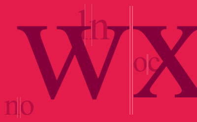
Some letters have way too much attitude to fit in a box. Watch out for slanted letters such as A, K, V, W, and Y. Letters with arms like L or T, or letters with cross strokes like E and F can be challenging too. They all fill the box unequally.
These aren’t the only culprits. Several letter combinations can look quite tricky. V and A, see easygoing but they aren’t. W and A cause some sticky situations, T or F beside a lower case rounded letters tend to complicate things a little, in addition to any of the problem letters in the middle of a word. These are all situations that call in your full kerning skills.
Rules are great, but you still have to use your own perception of how this particular font with this specific size looks. You do recall what Picasso said about learning the rules like a pro and breaking them like an artist.
Be Aware of Point Size
A large banner, a medium-sized poster, and a business card, all having the exact same logo and tag line, would need individual kerning for each medium. This is because of the point size.
Text written with a 60 point font will show the effects of kerning far more than the same one at 12 or 14 point. The larger you go, the more careful you need to be with letter spacing.
A rookie mistake graphic designers usually make is, they finish their kerning and then change the point size. Whether it’s an increase or decrease, the letter spacing is blown out of proportion, and a new kerning session is in order.
Kerning Game
Manual kerning is a subjective skill. There’s no ruler or automated system to give you a final verdict, you have to develop your skill, and nothing does that more than practicing what you learned.
There’s an interesting online game with a simple and very expressive name: kerning game. They give you the first and last letter in a word, and your goal is to adjust the spacing between the letters.

You can use a touch screen or a mouse to adjust the letter spacing. Take your time, it doesn’t rush you. When you’re done, choose the option that says ‘compare’ then press ‘both’.
It’ll display your kerning with the ideal form for that word. This way you can tell how close you are to the preferred adjustment.

After a while, you’ll get the spacing right. Your adjustments will coincide more often with the ideal, and you’ll sort it out in a significantly shorter time.
Some Parting Thoughts
Kerning might seem like a redundant step in a graphic design project or leaning heavily towards perfectionism. This isn’t the case at all. Watching some of the innocent mistakes that automated spacing system does is enough to demonstrate our point.
Kerning marks the difference between well-thought-of work and amateurish trials. The impact of beautiful design and neat execution cannot be emphasized enough. Let’s just say it’s the reason why you’d get the next project and the one after that.