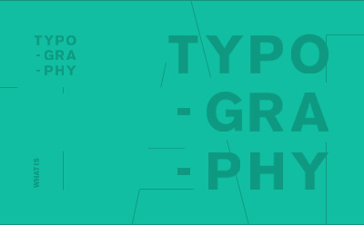
What Is Typography?
Typography is the art and craft of arranging type to make written words. Typography is most important in professions such as Graphic Design, Art Direction, Content Writing, and Marketing.
Typography Fundamentals
No matter what creative discipline you are in, knowing the fundamentals of typography is critical. The decisions related to typeface choice, and how to layout type are the difference between good and bad design.
I look forward to sharing with you typography basics, and some more advanced tips. Navigate down to learn the basics first.
01: Serif vs Sans Serif
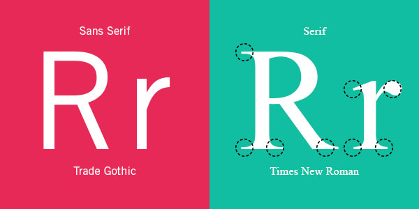
A Serif is a decorative line or taper added to the beginning and/or end of a letter’s stem. Sans Serif, as the name suggests, is simply the absence of the serif.
02: Leading
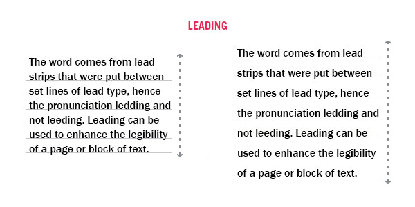
Leading in typography refers to the distance between adjacent lines of type. Back in the days of hand-typesetting, leading referred to thin strips of lead that were inserted into the forms to create the vertical distance between lines of type. These days, leading refers to the distance from one baseline to the next.
03: Kerning

Kerning is the art of making letters look aesthetically pleasing and well-put-together. It’s the manual adjustment of the spaces between letters to make them seem equally spaced. Check out a more detailed breakdown on Kerning Here.
04: Tracking
Tracking refers to a uniform adjustment to the spacing of a word or block of text. Not to be confused with Kerning (the manual adjustment of space between), adjustments to tracking will change spacing between all letters in a word or block of text.
05: Drop Cap
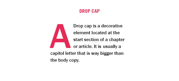
A drop cap is a decorative element located at the start section of a chapter or article. It is usually a large capital letter at the beginning or a paragraph or text block. It has the depth of two or more lines of body text.
06: Gutter
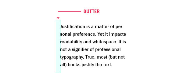
Gutters in typography are vertical whitespaces or rules, that separate vertical blocks of content. In design software, gutters are seen as guide layers.
07: Alignment & Justification
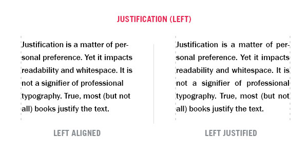
Left Aligned: The text is aligned along the left margin or gutter, also known as left-aligned, ragged right or ranged left.
Left Justified: The text is aligned along the left margin or gutter. Letter and word-spacing is adjusted so that the text falls flush with both margins except the last line.
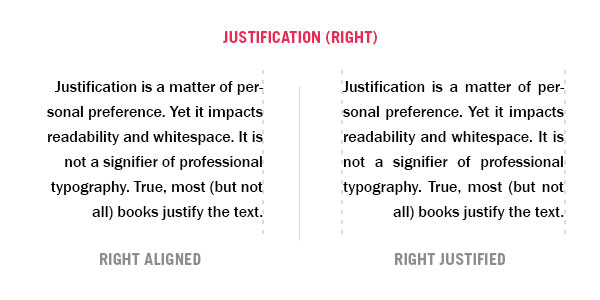
Right Aligned: The text is aligned along the right margin or gutter, also known as right-aligned, ragged left or ranged right.
Right Justified: The text is aligned along the right margin or gutter. Letter and word-spacing is adjusted so that the text falls flush with both margins except the last line.
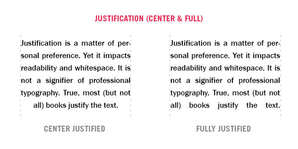
Center Justified: Text is aligned along the left and right margins. Letter and word-spacing is adjusted so that the text falls flush with both margins, except the last line.
Fully Justified: Text is aligned along the left and right margins. Letter and word-spacing is adjusted so that the text falls flush with both margins.
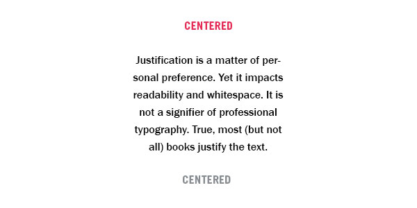
Centered: Text is aligned to neither the left nor right margin; there is an even gap on each side of each line.
Now that you know the basics, read on to see a deeper dive into all the typography terms.
Typography Terms
If you are starting out as a Graphic Designer, or just need to know more about Typography, knowing the fundamentals of Typography is key. Let’s start with the terminology of typography. I’ve created some visual examples to make it easier for you to understand.

Aperture

Apex

Arc

Arm

Ascender

Ascender Line

Axis / Stress

Ball Terminal

Baseline

Beak

Bilateral Serif

Bowl

Bracket

Cap Height

Counter

Crossbar

Cross Stroke

Crotch

Descender

Descender Line

Ear

Eye

Finial

Foot

Gadzook

Glyph

Grotesk

Hairline

Halbfett

Hook

Inktrap

Joint/Juncture

Leg

Ligature

Link/Neck

Loop

Midline

Overshoot

Pro

Shoulder

Small Caps

Spine

Spur

Stem

Swash

Tail

Taper

Terminal

Tittle

Vertex

Weight

X-Height
Typography Rules
Justification:
Use One Font:
Skip A Weight:
Double Point Size:
Align To One Axis:
Limit Your Fonts:
Group By Using Rules:
Use Negative Space:
Mind The Gap
The arrangement of type involves legibility, readable, functional and appealing when displayed. The arrangement of type involves selecting typefaces, point sizes, line lengths, line-spacing (leading), and letter-spacing (tracking), and adjusting the space between pairs of letters (kerning).
The term typography is also applied to the style, arrangement, and appearance of the letters, numbers, and symbols created by the process. Type design is a closely related craft, sometimes considered part of typography; most typographers do not design typefaces, and some type designers do not consider themselves typographers. Typography also may be used as a decorative device, unrelated to communication of information.
Typography is the work of typesetters, typographers, graphic designers, art directors, manga artists, comic book artists, graffiti artists, and, now, anyone who arranges words, letters, numbers, and symbols for publication, display, or distribution, from clerical workers and newsletter writers to anyone self-publishing materials.
Until the Digital Age, typography was a specialized occupation. The digital era opened up typography to new generations of previously unrelated designers and lay users. As the capability to create typography has become ubiquitous, the application of principles and best practices developed over generations of skilled workers and professionals has diminished. So at a time when scientific techniques can support the proven traditions (e.g., greater legibility with the use of serifs, upper and lower case, contrast, etc.) through understanding the limitations of human vision, typography as often encountered may fail to achieve its principal objective: effective communication.