Graphic Design Basics?
If you are looking to learn Graphic Design, there are two fundamentals areas you should probably start with. First, is the principles of design. Second, the elements of design. If you learn these foundational principles, you will be on the right path to creating effective visual designs. Let’s go!
Before we dive in, a good way to think of the two fundamentals of design is this; the elements of design are the tools. Where-as, the principles of design are more like guidelines, or theory, for how to use those tools. In short, both are critical and should be used hand-in-hand.
Principles of Design
In the design community, I’m noticing that some confuse the principles of design, with the elements of design, or vice-versa. I have 7 for both categories. Let’s get into the principles.
01: Balance

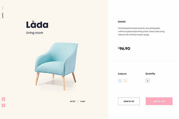
In design, balance is a state of equilibrium or equal distribution of visual weight. Yet balance can be achieved in a number of ways. For example, there is symmetrical and asymmetrical balance. Symmetrical balance can be achieved by distributing elements of design evenly within a composition. On the other hand, asymmetrical balance uses the contrast of elements to create visual flow and hierarchy.
02: Contrast
In graphic design, contrast refers to the juxtaposition of two elements that are different or opposite in appearance. Contrast is used by designers to create focal points, as well as giving objects greater visual weight and balance.
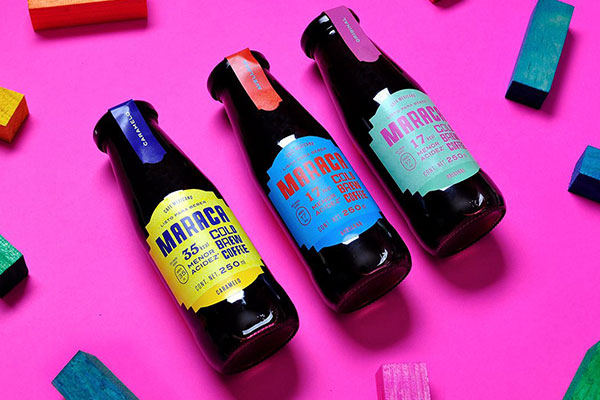
Graphic design elements that can be used to create contrast are; color, scale, shape, and typography.
Color

Scale

Shape

Typography

03: Emphasis

Emphasis is defined as an area or element within the composition that draws attention and becomes a focal point. You can use graphic design elements in combination such as contrast, color, and scale to create visual hierarchy through emphasis.
04: Repetition/Rhythm
Pattern

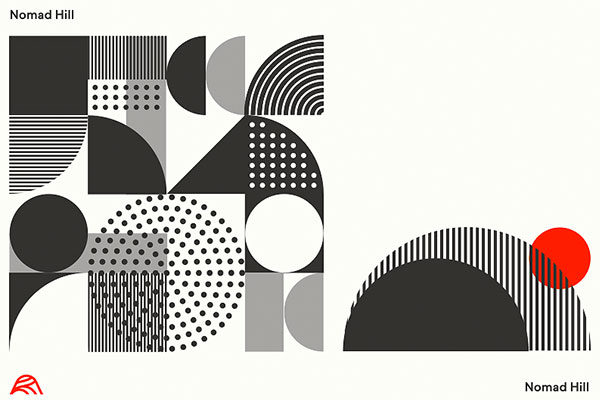
Rhythm can be thought of as a pattern in movement. You can hear it in varied sounds to create music or in the steady sound of rain hitting your roof. It can also be seen in design; think about painted bars on the ground at a crosswalk. Rhythm can be seen and heard throughout nature and in our designs through repetition, alternation, and progression. These three methods of achieving rhythm can be applied to visual design as a way to create order, interest, and focus, and to help lead viewers through the content.
Alternation

Alternation is used to create rhythm by alternating some of the elements in a regular pattern.
Progression

Rhythm can also be created through progression. For example, gradation of color, or a series of graphic design elements that start small and become larger.
05: Movement
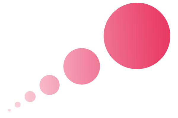
Movement refers to the way your eye moves through a picture. The various tools/elements of design can be used to create movement. In this case, space, scale, and space are used to move the eye through the image.
06: Harmony

Harmony is when all the components of the design work together in unison without one casting a shadow over the other. Harmony is achieved by adding just enough, not by adding too much. You know when a design is complete when all of its details complement each other.
07: Variety

Variety is about varying elements and objects in your composition, to create visual interest. Variety can be created in a number of ways. For example, different elements, color, scale, proximity, etc. Overall, the best way of thinking about variety in design is basically the opposite of repetition. Intentionally breaking repetition, pattern, or rhythm.
Elements of Design
Now that we know the principles of design, which is the theory, let’s cover the elements of design. In other words, the tools. Here are 7 basic elements of design that every graphic designer should know and utilize in his/her designs.
01: Line
We all know what a line is when it comes to drawing, but in the field of graphic design, lines are basically the connection between any two points. Lines are the most basic factors in design and they’re used for a wide variety of purposes. A great example of how lines are used to garner the attention of viewers and draw their eyes to a certain location is how books and magazines utilize lines to separate headlines from the content itself.
02: Color
Colors are an obvious component of design because they help develop an atmosphere or mood for the design. Expressions like ‘feeling blue’ or ‘seeing red’ solidifies the fact that colors tend to carry certain impressions and emotional depth. Colors can stand alone or work in unison with an array of other elements such as lines, shapes, and textures.
For more info color, check out our article on Color Theory here!
03: Shape
Whether organic or geometric, the incorporation of shapes adds interest and definition because they’re confined by boundaries created by lines or colors. Shapes tend to be utilized to create a sense of emphasis over a certain part of the design, be it on a magazine or web page. A graphic designer really shines when he/she knows how different shapes can interact together.
05: Texture
By definition, texture is the feel, appearance, or consistency of a certain surface or a substance, which seems like something that you don’t need to consider as far as graphic design. However, the fact of the matter is that texture can transform a two-dimensional medium into one that has three dimensions working for it. That’s something you can see on a lot of websites.
06: Typography

Similar to lines, colors, shapes, and textures, the fonts you use on a design can help deliver a certain feeling across to the viewer. For instance, you can utilize a certain font to imply seriousness or you can utilize another to give out a playful feel. The decisions related to typeface choice, and how to layout type are the difference between good and bad design.
What to learn more about typography, check out our article here.
07: Scale
There’s nothing more boring than a page that has similarly-sized shapes and objects. Scale is a vital factor of design because it helps add emphasis and interest. The variation in the size of the shapes, objects, or fonts needs to be subtle if it’s intended for professional content. For creative endeavors, however, bold variations are preferred.
Conclusion
Now that you know the graphic design basics, you are equipt with the theory and tools to get started. What do you think about the principles of design? How you can use them to better utilize the tools/elements of design? Let us know in the comments below.
